Introduction
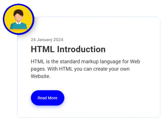
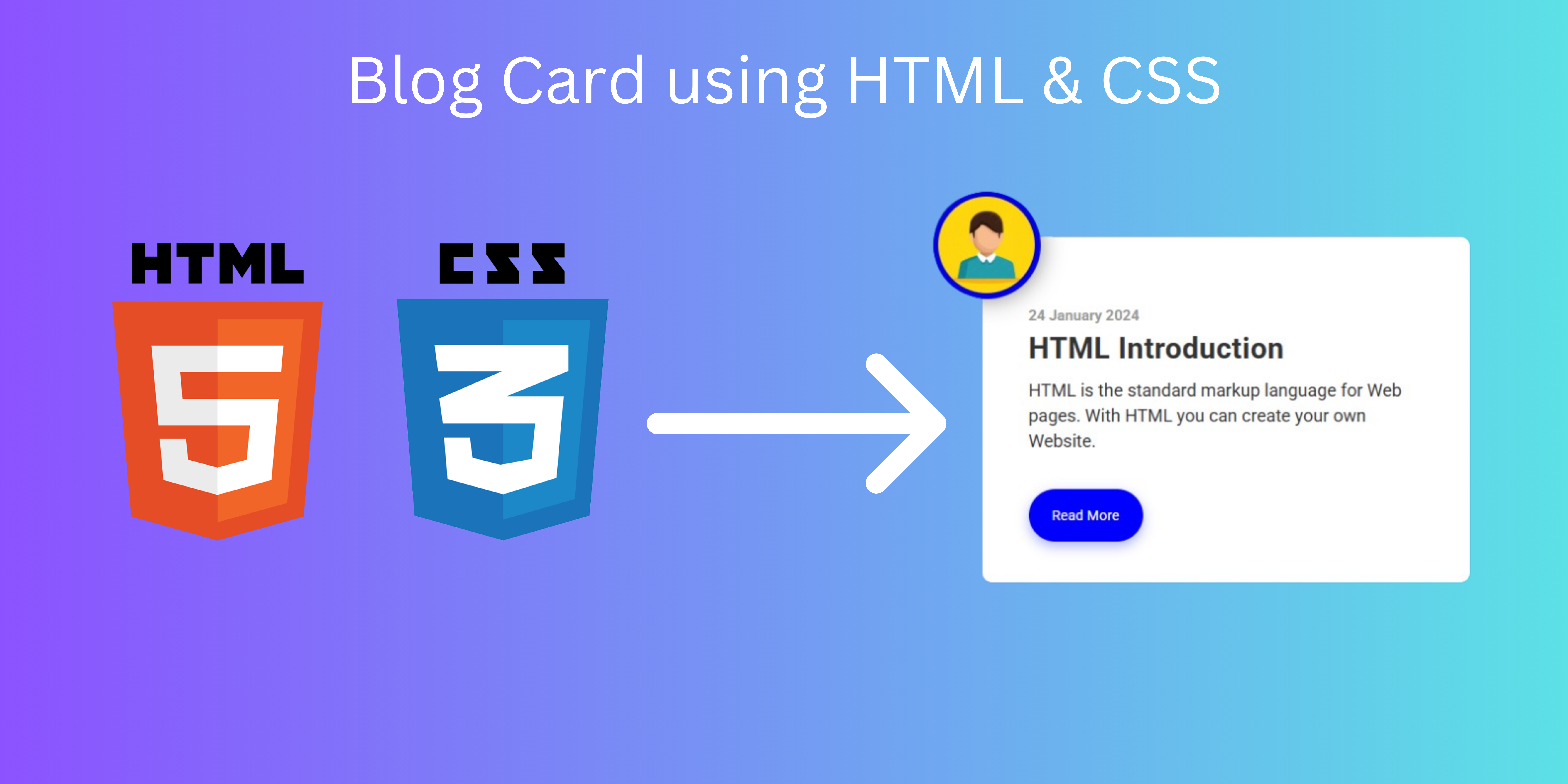
A blog card is a design component that shows a blog entry along with details like the author, title, image, description, and Read More button.
Source Code:
HTML:
<!DOCTYPE html>
<html>
<head>
  <title>Blog Card</title>
  <link rel="stylesheet" href="style.css" />
</head>

<body>
  <div class="blog_post">
    <div class="img_pod">
      <img src="https://img.freepik.com/free-vector/
    businessman-character-avatar-isolated_24877-60111.jpg?
    t=st=1737816213~exp=1737819813~hmac=fcfed119289f4c30c83ec3f46a78546c2
    999ba5b1e3ff7a36ff16d61f659ae23&w=740"
    alt="random image" />
    </div>
    <div class="container_copy">
      <h3>24 January 2024</h3>
      <h1>HTML Introduction</h1>
      <p>
        HTML is the standard markup language for Web pages.
        With HTML you can create your own Website.
      </p>
      <a class="btn_primary" href="#" target="_blank">Read More</a>
    </div>
  </div>
</body>
</html>
CSS:
@import url("https://fonts.googleapis.com/css?family=Roboto:300,400,700&display=swap");

* {
  margin: 0;
  padding: 0;
}

html {
  font-family: "Roboto", sans-serif;
  font-size: 12px;
}

body {
  height: 100vh;
  display: flex;
  justify-content: center;
  align-items: center;
  padding: 2rem;
  background: #1488cc;
  background: -webkit-linear-gradient(to right, #2b32b2, #1488cc);
  background: linear-gradient(to right, #2b32b2, #1488cc);
}

.blog_post {
  background: #fff;
  max-width: 500px;
  border-radius: 10px;
  box-shadow: 1px 1px 2rem rgba(0, 0, 0, 0.3);
  position: relative;
}


.container_copy {
  padding: 6rem 4rem 5rem 4rem;
}

.img_pod {
  height: 110px;
  width: 110px;
  background: blue;
  z-index: 10;
  box-shadow: 1px 1px 2rem rgba(0, 0, 0, 0.3);
  border-radius: 100%;
  position: absolute;
  left: -10%;
  top: -13%;
  display: flex;
  align-items: center;
  justify-content: center;
}

img {
  height: 8.3rem;
  width: 8.3rem;
  position: relative;
  border-radius: 100%;
  box-shadow: 1px 1px 2rem rgba(0, 0, 0, 0.3);
  z-index: 1;
}

h3 {
  margin: 0 0 0.5rem 0;
  color: #999;
  font-size: 1.25rem;
}

h1 {
  margin: 0 0 1rem 0;
  font-size: 2.5rem;
  letter-spacing: 0.5px;
  color: #333;
}

p {
  margin: 0 0 4.5rem 0;
  font-size: 1.5rem;
  line-height: 1.45;
  color: #333;
}

.btn_primary {
  border: none;
  outline: none;
  background: blue;
  padding: 1.5rem 2rem;
  border-radius: 50px;
  color: white;
  font-size: 1.2rem;
  box-shadow: 0px 5px 1rem rgba(94, 110, 255, 0.5);
  transition: all 0.2s ease-in;
  text-decoration: none;
}

.btn_primary:hover {
  box-shadow: 0px 5px 1rem rgba(94, 110, 255, 0.5);
}

@media only screen and (max-width: 650px) {
  body {
    background-color: black;
  }
}
Output